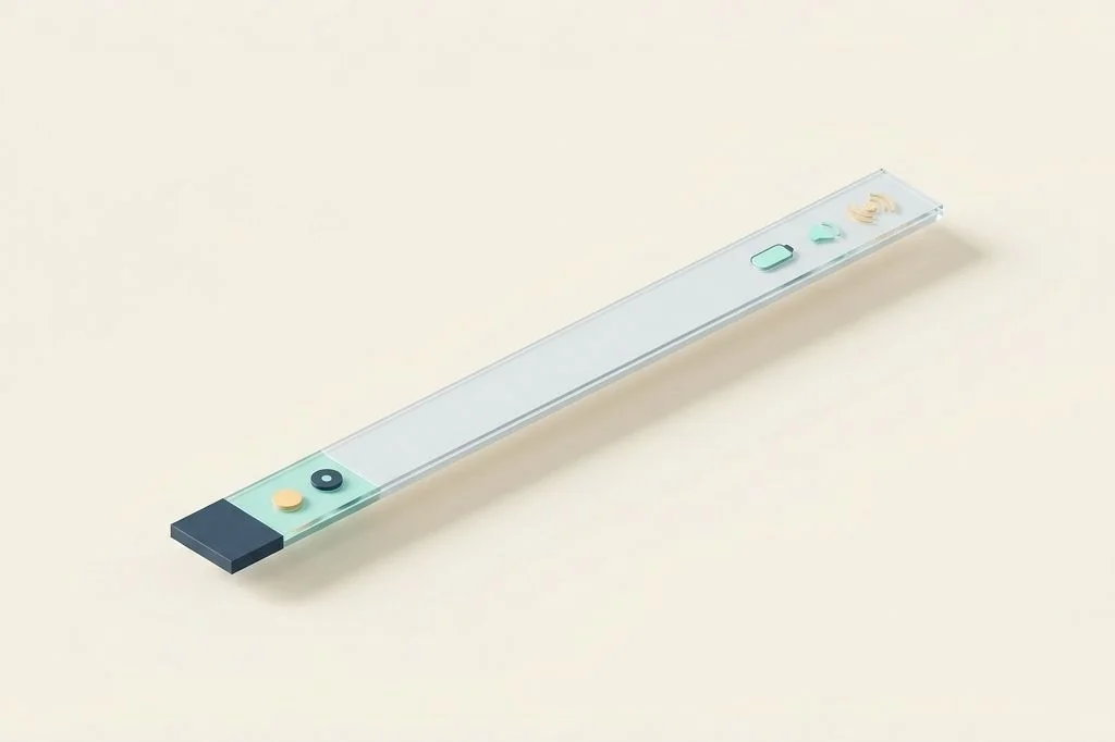
Look up at the top right corner of your computer screen. How many tiny shapes, numbers, letters, and colored dots are staring back at you right now? For many knowledge workers, that slender horizontal margin hosts fifteen to twenty-five competing icons. Every single one of those icons represents a tiny digital eye watching you, blinking when a sync completes, flashing a red dot when an update arrives, or waving a miniature graph. Applying the three icon rule for a distraction free macos top bar establishes a strict visual boundary that quiets your field of vision, preserves mental clarity, and transforms your screen into a calm creative sanctuary.
Key Takeaways
Here are the core principles for implementing the three icon rule on your Mac:
- A tranquil display resembles a traditional Japanese dining table; having only chopsticks, a bowl, and a teacup creates deep respect for the meal.
- The only three status indicators worthy of permanent visibility are your clock, your battery percentage, and your network signal.
- The macOS Control Center already consolidates volume, display brightness, Bluetooth, and AirDrop into a single unified menu.
- Banishing notification dots and blinking badges prevents peripheral eye fatigue and protects sustained creative flow.
The Japanese Dining Table Metaphor
To understand why radical simplicity changes how you feel at your desk, picture sitting down to dinner at a traditional Japanese tearoom. On the smooth wooden table before you, there are exactly three items: a pair of dark bamboo chopsticks resting on a ceramic holder, a warm bowl of fragrant rice, and a small earthenware cup of green tea.
There are no plastic bottles of ketchup, no half-empty soda cans, no paper napkins blowing in the breeze, and no stacks of junk mail lying beside your bowl. The emptiness of the table commands calm and presence. Every bite tastes richer because your senses are not bombarded by visual clutter.
Now look at the typical modern computer display. Above your active document, twenty colorful icons blink and bounce. It is the digital equivalent of eating dinner on a table crowded with car keys, cereal boxes, tools, and laundry detergent bottles. You cannot experience peaceful concentration because your peripheral vision is constantly snagged by visual noise. Practicing minimalist computer management requires treating your screen with the same reverence as that polished wooden table.
Defining the Three Essential Status Indicators
Why exactly three icons? Through years of analyzing digital ergonomics, I found that human beings working on a computer only need to know three continuous environmental variables. Every other status indicator is either redundant, actionable only once a week, or already accessible through an existing system menu.
Indicator 1: The digital clock (temporal grounding)
A simple numeric clock (hours and minutes) keeps you anchored in time. It lets you pace your writing sessions and ensures you never arrive late to a scheduled meeting. Keep the formatting clean: remove the day of the week, remove flashing seconds colons, and remove decorative analog faces.
Indicator 2: Battery gauge (power survival)
When working untethered from a wall outlet, your remaining battery level is a non-negotiable metric. It tells you when to save your work and seek an electrical outlet. Display the numeric percentage alongside a minimal outline icon so you have precise status at a single glance.
Indicator 3: Wireless network beacon (data connectivity)
The Wi-Fi icon provides instant confirmation when you are researching or sending files. If a webpage stalls, a half-second glance tells you whether your internet connection dropped or whether the remote web server is taking its time. If you use external displays, our companion study on designing a zero clutter menu bar for ultrawide and laptop screens explains how this three-element balance scales across wide displays.
Architectural Comparison: Overcrowded Strip vs Zen Three-Icon Layout
Comparing the two setups side by side illustrates the dramatic shift in visual environment and system resource consumption.
| Operational Dimension | Overcrowded Top Bar (20+ Icons) | Disciplined Three-Icon Layout |
|---|---|---|
| Visual Peripheral Load | High cognitive friction; constant eye saccades | Zero peripheral pull; eyes stay locked on work |
| Screen Real Estate | Extends 350 to 500 pixels inward from edge | Occupies less than 120 pixels in far corner |
| Notch Screen Hazard | Frequent clipping behind camera cutout | Impossible to collide with hardware notch |
| Access to Extra Tools | Hunting and pecking through tiny symbols | Consolidated single click in Control Center |
| Background Memory Footprint | 150 MB to 400 MB across separate daemons | Near zero beyond native macOS services |
Notice the complete elimination of notch collisions. Because three small indicators occupy barely one hundred pixels, your status strip ends inches before reaching the physical display cutout on modern laptops. For users seeking software solutions to manage remaining tools, reviewing our guide on collapsible menu bar managers for notch screen macbooks provides practical methods for tucking extra utilities into hidden drawers.
The Hidden Power of Control Center
Many users resist removing icons like Bluetooth, Sound, AirDrop, and Display Brightness because they fear losing control over their hardware. But in modern versions of macOS, Apple introduced a dedicated Control Center icon that sits right beside your clock.
Think of Control Center like a tidy tool tray sitting in the top drawer of your desk. When you click that single pill-shaped icon, a clean panel slides down revealing smooth sliders for sound volume and screen brightness, one-click toggles for Bluetooth devices, and Do Not Disturb switches. Apple provides detailed customization instructions in the official Apple macOS Control Center settings guide.
Having individual icons for volume and Bluetooth pinned permanently to your top bar is like keeping a roll of duct tape and a hammer sitting on your dinner plate all day. Keep them in the drawer where they belong, and summon them with a single click only when you actually connect headphones or adjust speaker volume.
The Peripheral Vision Tax: Why Human Brains Hate Clutter
To understand why a crowded top bar exhausts you by lunchtime, we must examine how human biology handles vision. Human eyes did not evolve to stare at glass screens. For thousands of years, our peripheral vision acted as a survival radar. If a saber-toothed cat moved in the tall grass or a heavy branch snapped overhead, the motion in the corner of your eye triggered an instant adrenaline pulse, forcing you to look up and prepare to run.
When you have twenty tiny icons sitting along the top edge of your laptop, your survival radar is constantly triggered by false alarms. A weather icon flickers with rain graphics, a cloud sync icon spins in a circle, and an email tool flashes a red badge. Even when you consciously focus on writing an analysis, your primitive brain spends subconscious energy suppressing the impulse to jerk your eyes upward.
Scientists call this cognitive suppression. By three o’clock in the afternoon, you feel drained and irritable, not because your writing was difficult, but because your brain had to suppress four thousand miniature visual alarms. Enforcing the three icon rule turns off those false alarm bells completely. With only three quiet, static markers in the corner, your primitive radar rests, allowing your full mental energy to pour into your work.
Frequently Asked Questions
What if my company requires me to run security software with a menu bar icon?
Many corporate security tools pin mandatory icons to your menu bar. You can employ a lightweight menu bar organizer to slide those mandatory corporate icons into a collapsed hidden drawer. The software continues to run uninterrupted for compliance, while your active screen stays peaceful.
How do I adjust volume quickly without a menu bar slider?
Every Mac keyboard features dedicated physical volume keys (F10, F11, and F12) or Touch Bar controls. Adjusting sound with physical keys takes a tenth of a second and never requires taking your eyes off your active document.
Can I hide the Control Center icon itself?
In modern macOS, the Control Center icon is a permanent system element, but its monochrome, pill-shaped design is remarkably unobtrusive. Treating it as a discreet single gateway to all secondary controls preserves the visual calm of your top bar.
Adopting the three icon rule is not about deprivation; it is about intentional focus. By sweeping away visual noise and keeping only what is genuinely vital in sight, your Mac transforms into a clean, respectful instrument dedicated entirely to your best thinking.